Hi Blue Hills Digital website visitor 👋🏻
What’s this page about?
You’ve heard metaphors like The cobbler’s children have no shoes or The carpenter’s roof is leaky.
In this case, the website consultant’s website is long overdue for a refresh. (I’m talking about myself. And this website.)
And unlike my client projects, I’m going to be working on refreshing the Blue Hills Digital website bit by bit, when I have time between other commitments, and in the open!
I introduced my goals for the website overhaul in an email to the Digital Landscape list in May 2025. Since progress is pretty slow and incremental, AND because I want to have some fun with the updates, I put this page together so I can post updates along the way and explain to visitors why some parts of the site might look different to other parts 🤪
Read on for updates …
Blue Hills Digital Website Changelog
-
📋 New Resources Launched
I checked off another milestone in this slow-moving, build-in-public-style website overhaul last week: I’ve now migrated all the various downloadable checklists and workbooks on the website into a new “Resource” content type 🎉
This comes with several BIG advantages for me as I manage the website and look at developing more resources in 2026:
- Resources are all managed in one location in the website dashboard, and all have a standard list of data fields. These include:
- Two images for each (one for the resource page header, and one cover image)
- A short blurb about the resource
- Whether it is free or paid
- The cost (if paid)
- A download link
- A hidden “tag” value that gets applied to the contact record in Kit for anyone that downloads the resource
- A templatized layout for a “single resource”. This means if I want to update how resources are displayed I can just update that one template rather than having to modify multiple pages.
- An auto-updating Resource Library page that will display all resources as the collection grows.
- The opportunity to insert resource promotions into other pages and articles on the website that will update dynamically if I modify information about the resource.
Here’s a quick look at the Resource Library page. This page displays a grid of all published resources (except for a few that are hidden because they’re only available as special offers for specific audiences 😉 ). Each block on this page pulls data from fields on the Resource content type. If I decided to display a short description of each resource in these boxes, I could do that with one modification to the template that drives this page.

And here’s the part I’m most excited about …
In the past, I would write a guide or article, and if I had a relevant downloadable resource, I’d create a little call-out box part way through the article with a preview image and a form you could fill out to request the resource. If I wanted to promote the same resource in another article, I’d copy and paste that section into a second article. And sometimes a third. That meant that if I needed to update that image or the form, I’d have to dig around the website trying to find all those promotions and make the same updates, several times. Not scaleable at all, and practically guaranteeing errors when I missed one of the instances.
This old system also required a separate form for each separate download, to make sure each download was connected to the right incentive email delivered by Kit (my email marketing platform). Again, this was starting to get messy as the number of resources increased, and when I needed to make changes to forms, I’d have to make the same repetitive edits over and over in multiple places.
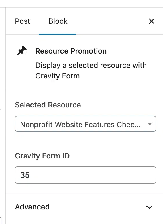
Now that I have resources stored in a custom post type, with a standardized set of fields, I was able to build a custom block for the WordPress block editor. This means when I’m writing an article and I want to insert a resource promotion, I can add my custom “Resource Promotion” block, select the resource I want to display from a dropdown menu of published resources, and boom 💥 a consistently-styled resource download section will appear within the article.
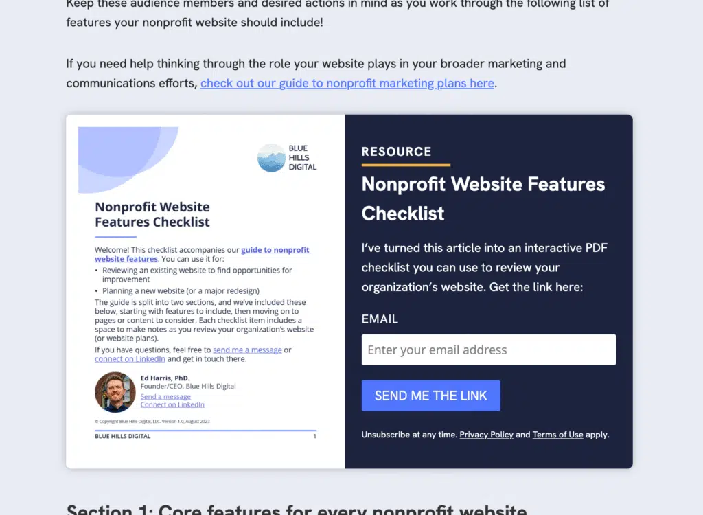
Better yet, this resource promotion block uses the same, single form for all resources (this works by passing the resource name into a hidden field in the form), and all resource promotion blocks across the site share the same styles. Once again, this means if I need to update the style or layout of these blocks in every place they show up across the site, I only need to make that edit in one place. Here’s a preview of the custom “Resource Promotion” block settings in the block editor. Pretty simple, right?!
This whole process is an example of a principal that drives all of my website development projects: look for places in your website content workflows where you have to make repetitive edits in multiple places, or where there are barriers to updating content, styles, or layouts. Approaches like the one I described here can unlock more efficient publishing, and I’m looking forward to reaping the benefits in 2026!
- Resources are all managed in one location in the website dashboard, and all have a standard list of data fields. These include:
-
✨ New homepage is live!
The redesigned homepage is live now! Go check it out over here. Following the theme switcher update last week, the majority of the page layouts on the website are updated now, but I’ll leave the announcement bar live for a while longer since there are a few product pages (like the Nonprofit Website Audit Workbook) that are still using the old design. That’s because …
The next step is to build out the planned “Resources” content type. This will be a place to house resources I develop, both free downloads and paid products. Once this is ready, those last few pages that currently house resource or product-type information can get converted over.
-
🔀 Theme Switcher
When re-theming a website, there are two ways to make the change:
- Build the new theme behind the scenes, on a development copy of the site … get everything looking perfect, and then swap out the site, or
- Make the changes incrementally, page by page
I wanted to use option 2 for this redesign, since the refresh didn’t just involve changing some font and color settings – it requires rebuilding content on most of the website’s pages, and I wanted to start pushing some of the changes live as soon as possible.
To do this, I needed a way to be able to have pages (and other content types) exist in one of the following two states (and if you’re familiar with how WordPress works, you’ll understand why this is tricky!) …
- Show the current (soon-to-be-old) header and navigation, existing font and colors set in the theme settings, etc.
- Show the new header and navigation, and use a set of updated font and color settings that will be updated in the theme settings once the refresh is complete.
To do this, I created a separate author that I can assign refreshed pages to, one by one, as I update them.
Then for pages with this author assigned, I have:
- Overridden the header with the new one
- Loaded an additional CSS stylesheet with the style overrides from the redesign
- Displayed an announcement bar giving some context about why these pages look different
Currently about half way through these updates, using this system, and it’s working so far 🙂
PS. At WordCamp US 2025, I saw a demo of Theme Switcher Pro, a plugin that packages up a more streamlined version of this functionality. I’m looking forward to using this on the next WordPress site I have to re-theme.
-
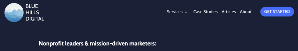
New header test drive
New today: I’ve built out an initial version of the header for the new website design, which you can see live on this Changelog page 👆🏻
The big change here is the flip to a light-color-background header, so I needed to use the inverted version of the logo and color scheme. For now, this new header is only visible on this page, but now it exists I can start flipping the design of other pages or sections of the website …
Old version:
New version:

-
Updated font = updated logo
[Project status: slowed down by Summer schedules and a couple of big client projects!]
The choice to update the brand font to use Hanken Grotesk means updating the logo. Sure, perhaps no-one else would notice if the logo continued to use Cabin, but I would see it every time.
Take a look at the header on this page right now. Today it’s still the old version. But if you’re reading this in the future, you’re probably seeing the new version (if you can spot the differences).
It’s a subtle change, but here it is:
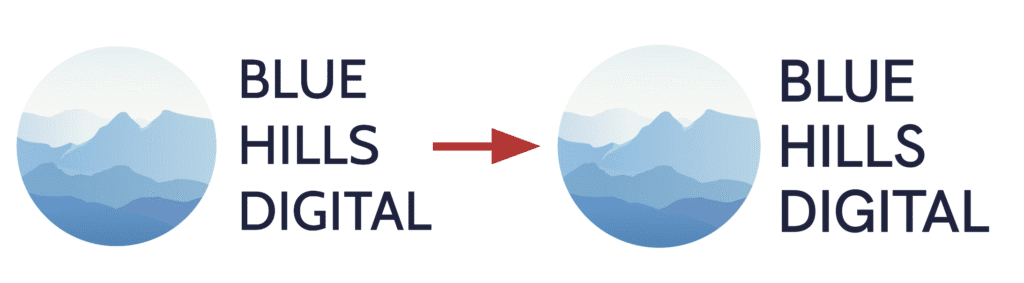
Cabin on the left in the current version, Hanken Grotesk on the right in the new (coming soon) version!
-
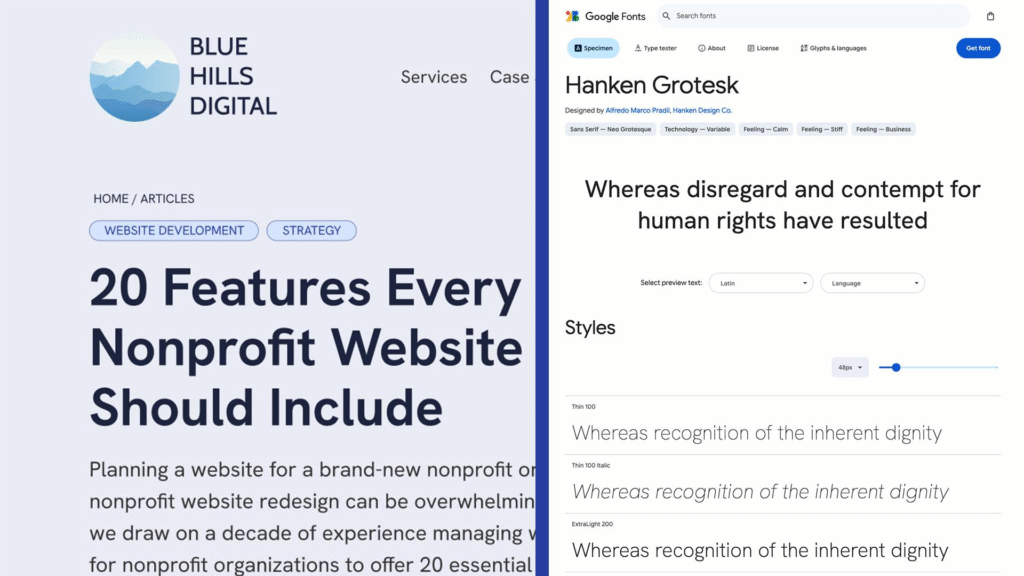
🔤 New font choices
The current Blue Hills Digital site uses two Google Fonts:
- Cabin, for headlines
- Open Sans, for body copy
At the time I’m writing this (June 10), you are reading these words in Open Sans, and the heading on this post is still Cabin. But at some point in the not too distant future, these words will change 🪄
First, why change? There’s nothing wrong with Open Sans and Cabin, I don’t think. Over time, however, I’ve come to dislike Cabin, and since this is my own website, I get to make changes based on a whim, without needing to build a business case for my boss 🤪
I’ve landed on Hanken Grotesk, an open source sans-serif typface that has a full set of weight variations and characters. It’s easily accessible via Google Fonts, and contains enough variety that I plan to use it across headings and body copy, unless someone persuades me that’s a terrible idea.
Here’s a preview that I shared with the Digital Landscape subscribers today:
-
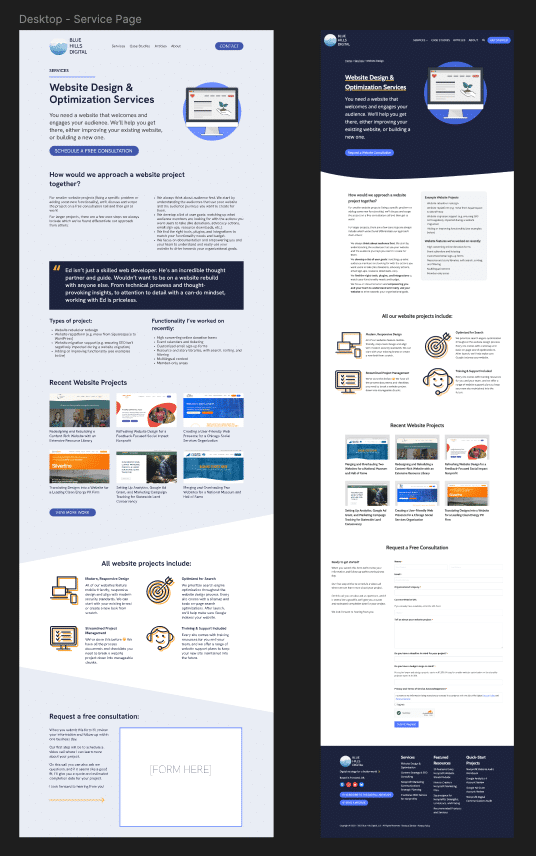
Page redesign: sneak peek 🫣
Still working on page redesign, and I shared a sneak peek with the Digital Landscape subscribers this week.
Like many nonprofit websites I work on, I’ve added pages on the Blue Hills website one at a time, over a number of years, without any really consistent style guide or set of building blocks 🤯
Fixing that situation is one of many motivations for overhauling the website now – the messiness is actually preventing me from updating the site with new content!!
And this is what makes this stage of a website redesign project so exciting! You get to see new page layouts start to come together, and you can visualize what those most-important-pages on your website will look like once they are rebuilt.
Progress is slow, because this project has to take a back seat to client work!
But here’s a snapshot from Figma of a new model page layout on the left, with the corresponding current page on the right.
-
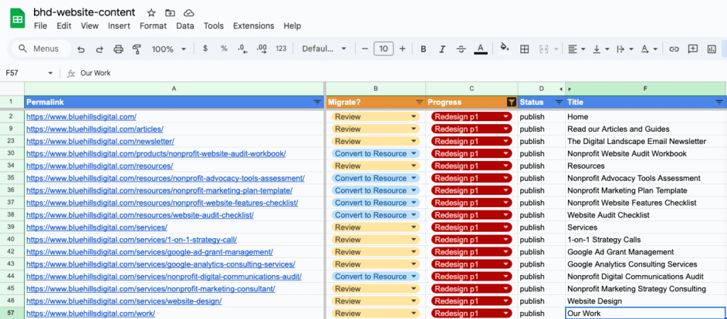
Creating a website content spreadsheet to manage the project
No visible changes yet, because PLANNING comes first. And that’s what I’m working on this week – building a spreadsheet with details of every URL — page, article, resource, etc — on the website, so I can plan and stage changes on the site.
Here’s a preview:
I send an email to the Digital Landscape list about this process today, with some recommendations for tools you can use if you’re doing something similar. Read the full email here.
-
Introducing the website overhaul project
This is an excerpt from a long email I wrote to the Digital Landscape email list today introducing this website refresh project! Click through to read about my goals for the project …
Pick your metaphor:
- The cobbler’s children have no shoes
- The carpenter’s roof is leaky
The website consultant’s website is getting outdated and has needed improvements for 2-3 years (I could probably get ChatGPT to make that sentence a little punchier).
For a client website project, I’ll typically work behind the scenes for weeks or months – planning, building, reviewing, testing – and then when we’re ready to launch, I’ll flip the switch the the brand new website replaces the previous version.
In this case, I have a business to run, so I need to work on this slowly; incrementally.
Today, I’ll share some goals for this overhaul. And in the coming weeks, I’ll focus on specific improvements as I deploy them. Most of these improvements will have parallels for your nonprofit websites (or perhaps for your own business websites, for the business owners on the list too).


